How to pair florals and geometrics for pizzazz in your home this season
When it comes to combining different patterns, most of us adopt a rather conservative approach, and for good reason too. After all, there is always the risk of combining too many contrasting patterns which may make your room look jarring rather than beautiful. However, when done in a restrained and planned manner, mixing patterns is a great way to add depth and colour to your space while also infusing it with some vivacity. If you’ve been toying with the thought of giving your living room a makeover this season, we suggest you start easy by playing around with two of the most common yet widely different patterns—florals and geometrics. Here are 7 tipson how you can pair the two to create just the right amount of drama without getting carried away.

Three’s company
Mixing different prints and patterns works best when done in odd numbers. However, if you are apprehensive about using too many prints lest your living room looks too cluttered, restrict yourself to three. To understand how to pick your prints, follow this guide: pick one bold print that will stand out among the rest of your décor elements. Florals are seemingly more eye-catching than geometric prints, so we recommend you opt for a bold floral design and work the other elements around it. For the second print, pick one that is entirely different from the first but smaller in size. So, if your first print is a floral, the second could be a medium-sized geometric design. The third print can be similar to either of the first two. For instance, a small floral print could work wonders with matching a floral and geometric.
Place them wisely
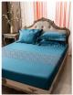
Where and how you place your patterns is essential to make sure they are utilized to their full aesthetic capacity. For instance, if you’re thinking about a printed wallpaper, it is best to stay away from a bold floral print as it runs the risk of not just looking too loud but also unseasonal. Instead, opt for a large geometric print and complement it with a window treatment that comprises medium-sized floral curtains or blinds. Similarly, if you’re giving your sofa a makeover, consider using fine geometric print upholstery and cushions with different floral prints but in matching colours.

Opt for similar hues
Mixing patterns as widely different as florals and geometrics is a bold statement in itself. Adding too much drama by excessive use of colours or over-accessorising will only make your space seem confusing and cluttered. To allow your assortment of prints to truly stand out, stick to a uniform colour palette and play around with different hues and tones within in. This is not to say that everything should be of the same colour. An effective way to balance patterns and colours is to set a basic palette that comprises two or more matching colours and then extrapolate those throughout the room. For instance, if you prefer pastel colours, continue to opt for subtle tones of the same colour throughout the room rather than metallic or jewel tones.

Experiment with different fabrics
While you need to be careful to not go over the top when pairing bold patterns like geometrics and florals, feel free to play around with different fabrics to create textural interest in your living room. For instance, if you are using floral curtains in a light fabric like sheer or linen, use a heavier fabric for your upholstery, such as twill or chenille, in a geometric design that’s easy on the eyes.
Break with solids
A sure-shot way of preventing your prints from becoming too overpowering is to throw a solid in the mix. This creates a welcome visual break amid a mélange of prints while making sure that the entire scheme of textures, patterns and colours remains easy on the senses. For instance, if your wallpaper is of a floral or geometric design or a mix of both, opt for solid curtains and drapes to balance it out. This trick works best in the case of your furniture and you can make the most of it by placing a solid cushion between two printed ones or simply throwing a runner on the armrest if your entire upholstery is patterned. However, make sure that the solid colour is in sync with the colours in the patterns or it may look terribly out of place.
 Maintain balance
The key to letting your prints blossom and shine is to spread them evenly across the living room. Be careful not to place majority of your prints on one side or corner as this will make your space look lopsided. Instead, alternate between florals, geometrics and solids to ensure that your living room looks like a balanced, well-rounded space.
Break the rules!
While it helps to conform to certain basic guidelines when it comes to doing up your home, especially the living room, remember that it is okay to break the rules every once in a while. So don’t be afraid to throw in that bold floral cushion on your sofa or break the monotony of a solid wall with an abstract geometric pattern wall art. Remember, at the end of the day, your space belongs to you alone. Just stick to your instincts and with our expert tips and tricks on hand, we are sure you can create a living room that not just looks good to your guests but also incites a sense of joy and belonging in your heart.
Talk to a Designer